Evolutionary Design is a process that supports natural software growth. It is based on the belief that we do not know the best design from the start of a project but we will figure it out together. It involves making small guesses / changes in the production environment, allowing time for more information to become available, and repeating that process. All changes are treated as experiments meant to deliver value and learn what the user actually needs. This flexible approach limits the cost of development by maximizing the amount of work not done.
Small Steps (Is it good enough?)
One of our clients has an application that creates video clips and they wanted to add the ability to edit the length of these clips. During the previous 2 years, when a clip needed to be edited the user would delete the original and create a new one. This process was inefficient for the user and the system.
The team started with a simple inexpensive solution, allowing them to deliver edit functionality in less than one day. The change was to add a new “Edit” item to the menu shown here:

This change addressed both the user and system inefficiencies but was not very elegant. Was it “good enough?”

Users reported that this new feature made editing easier for a portion of their use cases, therefore the decision was made to invest more in this feature. The next experiment was to allow context specific editing of a clip via the video transcript text. Prior to the change, the text for a clip was shown highlighted like this:

Icons were added to the ends of all clips to allow for editing the clip one word at a time:

While implementing this change, the team identified that the highlight spacing had some existing issues that were more obvious now with the addition of the icons. This first change was deployed to production and over the next two days the team delivered multiple changes a day to address minor issues. The design evolved to this:

Again the team did not feel like it was elegant, but was it “good enough”? Allowing time for user feedback the team moved onto another feature. Often good ideas appear when we are not actively thinking about them. That occurred for one of the team members and a week later the design was updated to this:

User feedback indicated that the majority of the remaining use cases were satisfied with this version of the feature. One user requested the ability to edit the clip more than one word at a time. Given it was only one user and the estimated effort to complete that work the team considered this feature “good enough” for now…..
Takeaways:
- Preference is toward the smallest solution.
- “Does it add value” or “Is it better” is the measurement of pushing something to production, even if there are minor issues.
- Increase in frequency of investment decisions.
- Feature is not considered “done” until user feedback and usage in evaluated.
Iterate, Iterate, Iterate (until it is good enough)
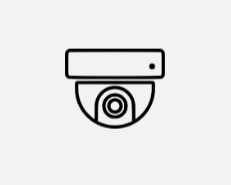
This example is from security software, the main functionality is the ability to place “elements” (door access, network head end, cameras and cables) on a blueprint to represent the physical system. The following steps represent the evolution of the camera element over a 10 week timeline. The first step was displaying the camera as a simple icon.
The first feature was the addition of a viewport that had three stretch points. As you can see from the picture the middle stretch point calculations were not 100% correct.
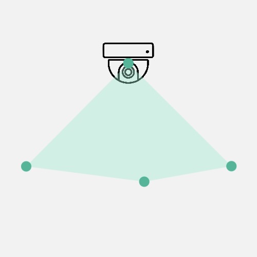
The team learned from this first experiment that the calculations for the stretch points were a bit more complex than expected. The developers had a tradeoff conversation with the product owner. The conversation resulted in the middle stretch point being removed, because the effort was not worth the user value at this time. The team could use their limited time to deliver more valuable features such as getting the viewport to work in all 4 quadrants of a circle. By removing this functionality the software was simpler and maybe the user did not need it.
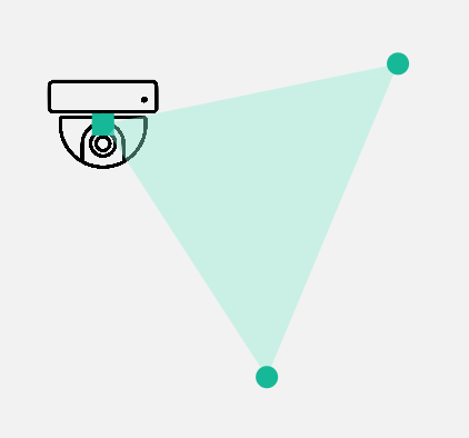
The following day a wall element was added to the system. The importance of walls in the system was to represent camera viewports restrictions due to the structure of a building. Given the complexity of this feature it was important to get it working early to decrease risk. This was much more important than a third stretch point.
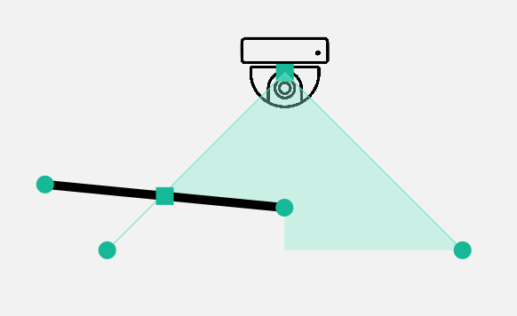
The team moved their focus to connecting elements. As part of that work, they gained a deeper understanding of the graphics tool they were using. With that new knowledge, adding an arc to the viewport became a fairly quick change. Based on earlier conversations with the product owner, the developers knew this was a nice to have feature. Without an additional conversation the developers added it and continued work on the next most important feature.
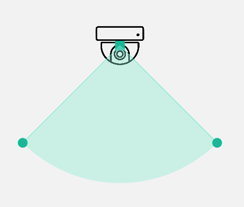
A few days later the team added the ability to have the viewport support up to 360 degree field of views. This was a feature that was needed in the 10 week period but was not considered the highest priority at this time. Due to other changes in the system, the geometry functions had matured to the point that implementing this was a 10 minute change. So the team just did it.
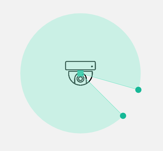
About a week later, the team decided (developers, designer and product owner) on a Material Design framework which resulted in an updated visual look for the camera.
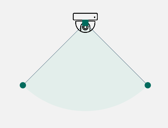
Two weeks were spent on numerous other features such as connecting elements, zooming, panning, and metadata before the camera had any changes. As part of adding metadata, the concept of a selected element was added to the system. So an unselected camera now looked like this:
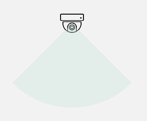
Later that day the label metadata field was added resulting in text displayed as part of the icon.
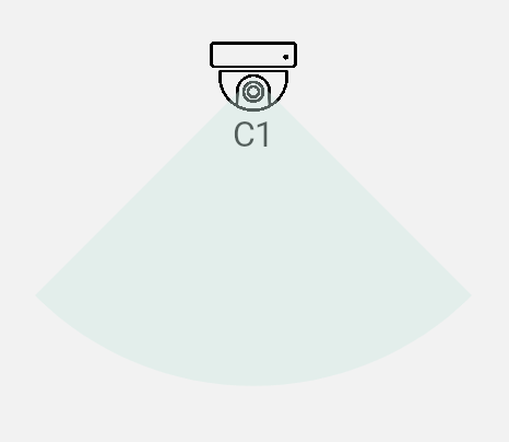
Another week went by and the color schema was updated across the system due to user feedback and influenced by the designer on the team.
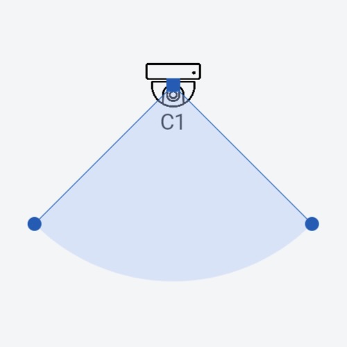
All of the main focus items had been completed prior to the 10 week deadline. This allowed the team to circle back on earlier features and focus a bit more on the user experience. Based on initial user feedback, one item that bubbled to the top of the priority list was adding the middle stretch point. This time it was much quicker to add because the geometry functions for other parts of the system had significantly matured since the original implementation.
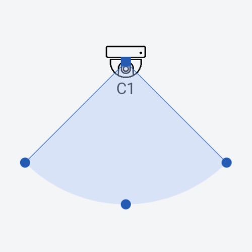
As the deadline approached, the team continued to iterate on the look and feel. This iteration a border was added around the selected icon to help it stand out when selected.
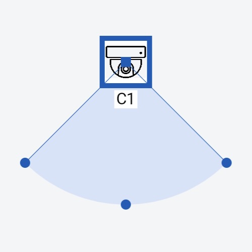
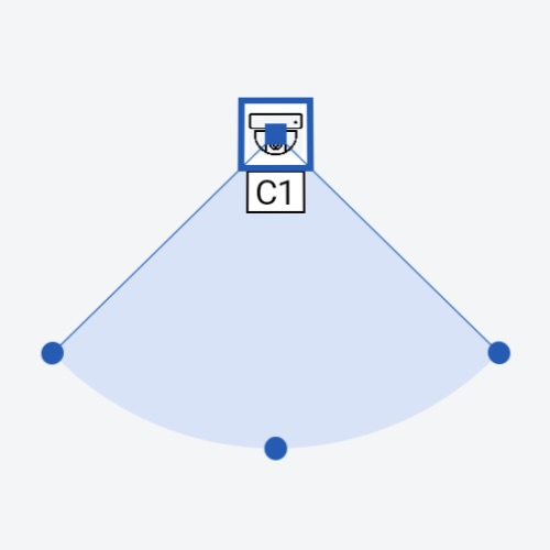
After adding the border, it was clear that the icon was too big, so during the last week before the deadline the overall size of the icon was decreased.
Takeaways:
- Speed of iterations will vary.
- Not all experiments are successful, that is ok as long as the team learned something.
- Reverting code may be faster than fixing it.
- Prioritization is a full team conversation around trade-offs.
- There will always be more ideas than time to do the work.
- Reusing existing code will lead to faster future development.
- Letting features time to breathe, will speed current and future development.
Start with something (even if you think it is wrong)
Once again this is from the security software. When a new project is started there is a lot of uncertainty. Maybe one person has a vision in their head but how do you get the rest of the team to understand that vision and make it even better. By starting with a few high level constraints and a description of what we think the user needs allows the team to refine that vision through a series of small changes. Since we are starting with a clean slate, the project was started with a simple button.
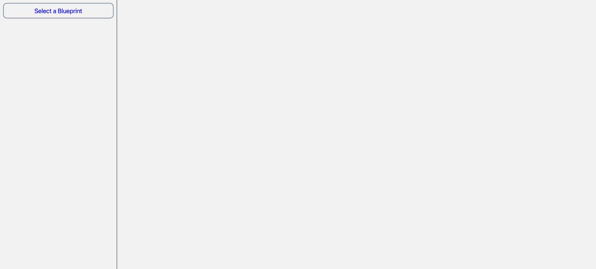
The text was updated to reflect domain language.

A color and font theme was applied to the whole application.

Size of the button was decreased to make it more visually appealing.
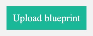
The theme was switched to use Material Design.
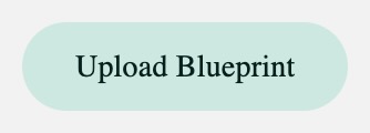
The button was moved from the left menu bar to the right side of the header.
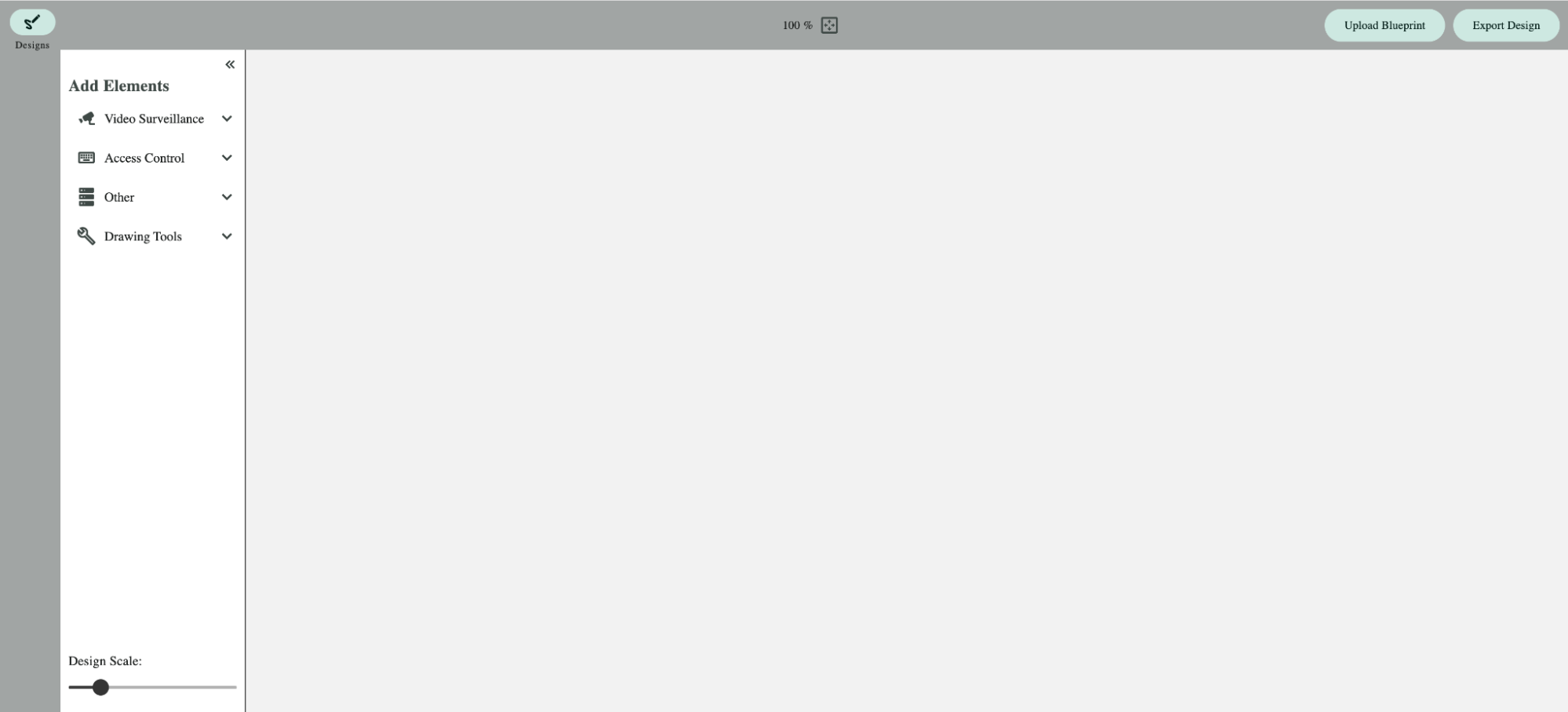
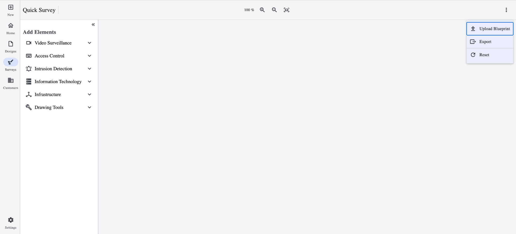
As more buttons were added, a menu was created to save on screen space as well as the color theme was updated a second time.
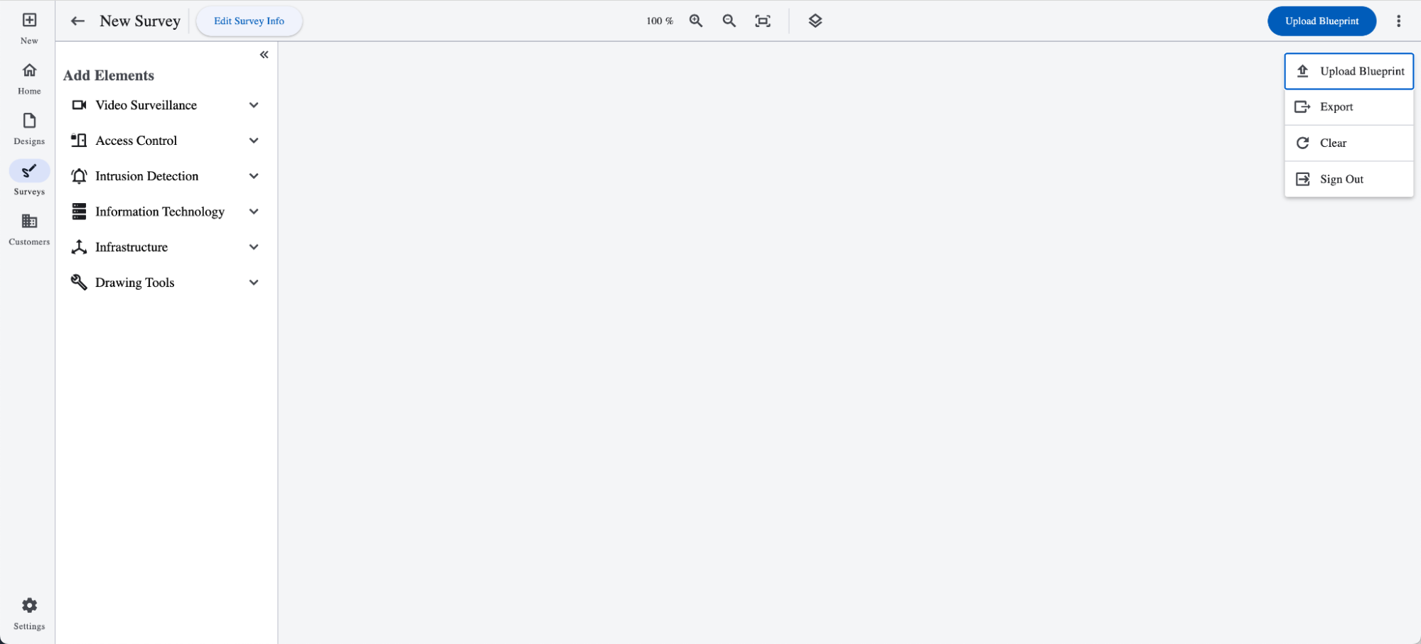
A second copy of the button was moved outside of the menu, so the action is more accessible until the first upload is completed.
Takeaways:
- Using a common language (also in the code) will speed up later work.
- Some items will be changed multiple times depending on user feedback.
- Surprises will occur, lean into them and learn.
Advanced Techniques:
- Batching groups of features from the same section of code, minimizes context switching while waiting for user feedback.
- Feedback loops can be shorten via monitoring tools and user interviews.
- Using user based feature flags minimizes risk.
- Painted doors determine if a feature is worth experimenting with.


